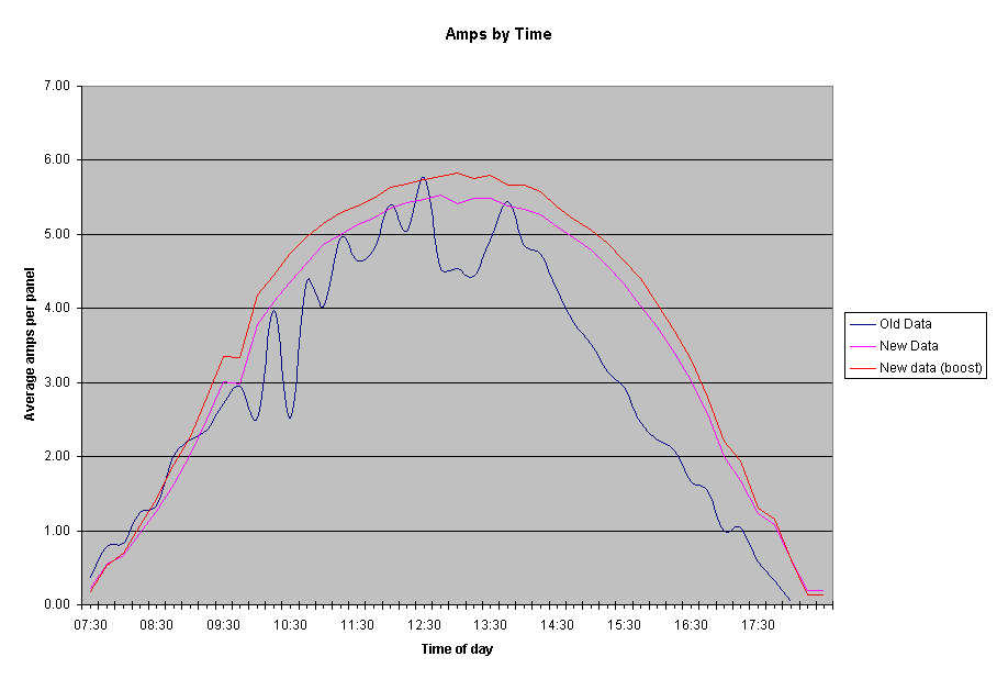


This chart is used for comparison between the old production and the new production data. The blue line is an average over all the original data. It seems strangely variable, but maybe the sample pool just wasn't big enough. The readings were all taken in the same place, so maybe that decreased their overall usefulness.
The purple line is exactly the same as the blue one except it is for the new readings (before boost). Note that although it is a much smoother bell curve, it is actually not as high as the old data in some places. This is surprising in one way, since both of the days I have taken the new readings so far have been clear and bright. However, it was a real fear, that for some reason the panels are not as efficient as they used to be before the fourth panel and the controller/booster. It appears that this may, sadly, be the case.
The red line is the same as the purple, except it includes the boost. It is surprising that the overall gain seems similar throughout much of the day (1/3 to 1/2 of an amp per panel) even though the total amps per panel number changes very dramatically. This indicates that the boost is much less efficient in the middle of the day than in the morning or late afternoon. See the new production data for boost percentages by time.
Top Level: Home | Destinations | Cruising Info | Underwater | Boat Guests | Ocelot | Sue | Jon | Amanda | Chris | Site Map | Make a Comment
|
If our information is useful, you can help by making a donation |
Copyright © 2000‑ Contact: Jon and Sue Hacking -- HackingFamily.com, svOcelot.com. All rights reserved.